What it really takes to bring a handcrafted brand to the web — design decisions, sleepless revisions, and the stubborn pursuit of getting it right.
The first question Sandra asked wasn’t „What should the shop look like?“ It was „What should it feel like?“ That distinction set the tone for everything that followed.
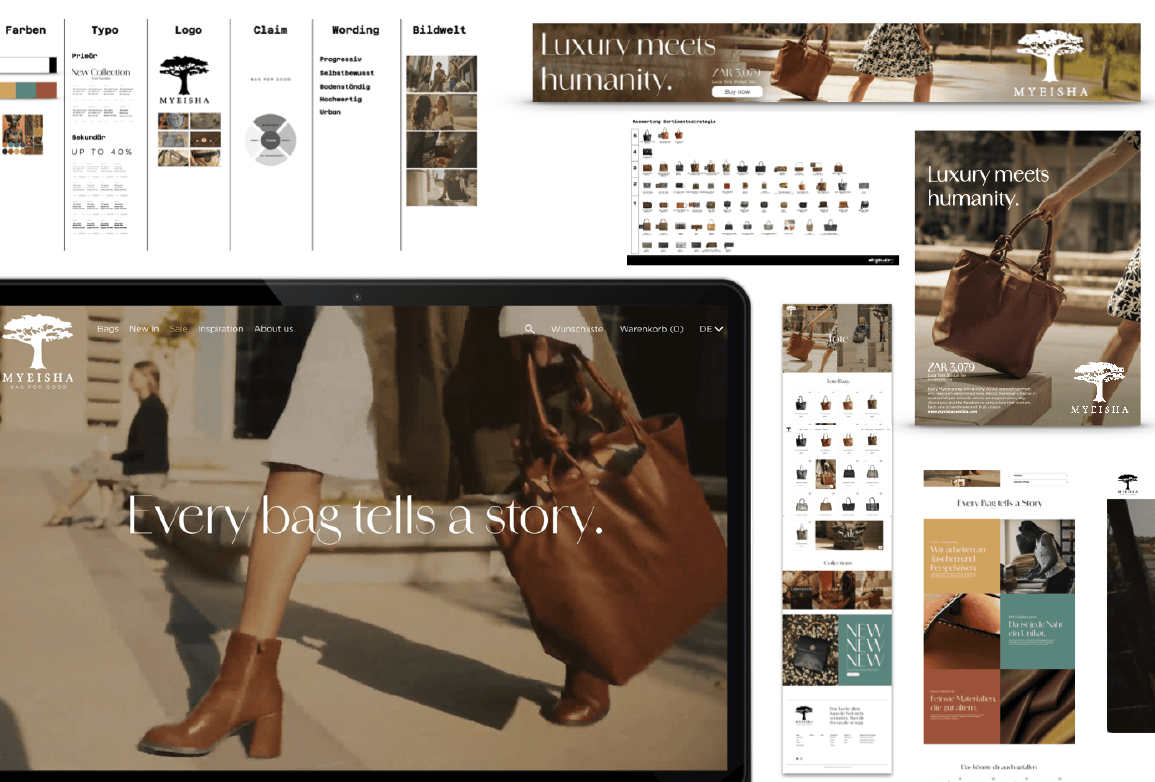
Building the MyEisha Namibia online shop at myeishanamibia.com was never going to be a quick project. The brand carries too much weight for that — the craftsmanship, the story behind every bag, the Namibian roots, the intention. A generic template wasn’t going to cut it. So we didn’t use one.
The Design Process Starts with a Feeling
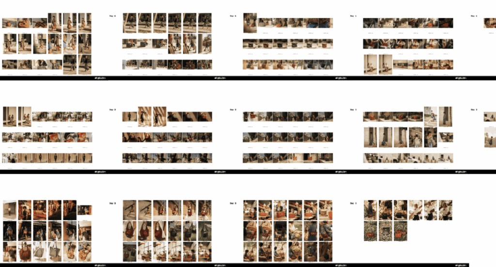
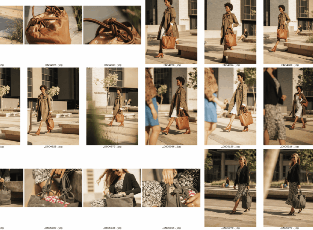
Before a single line of code was written, there were mood boards. Lots of them. We talked about warmth — earthy tones, natural textures, the kind of palette that feels sun-dried and intentional. We pulled references from editorial fashion photography, from African textile patterns, from independent designer brands that had nailed the balance between handmade and premium.
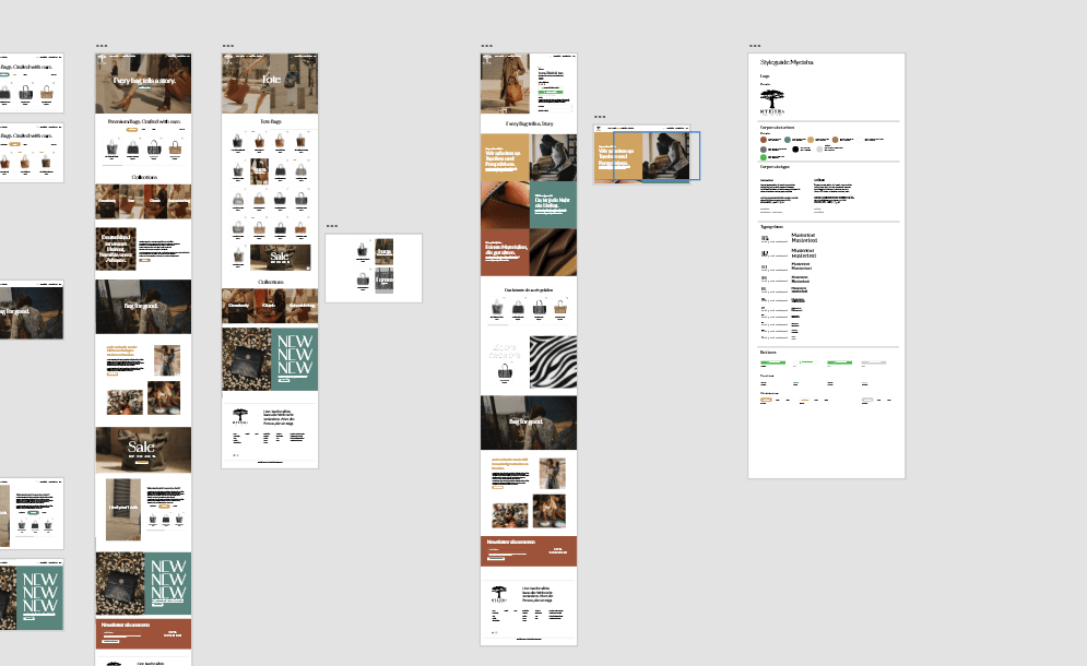
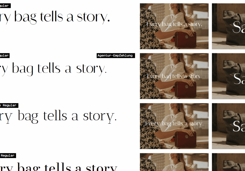
Every color was debated. Every font was tested at multiple sizes on multiple screens. The imagery — what gets shown, in what order, at what scale — was treated as seriously as the product descriptions themselves. Because in e-commerce, the image is the first impression, especially when you’re selling something you can’t touch through a screen.
The Technical Side: More Decisions Than You’d Expect
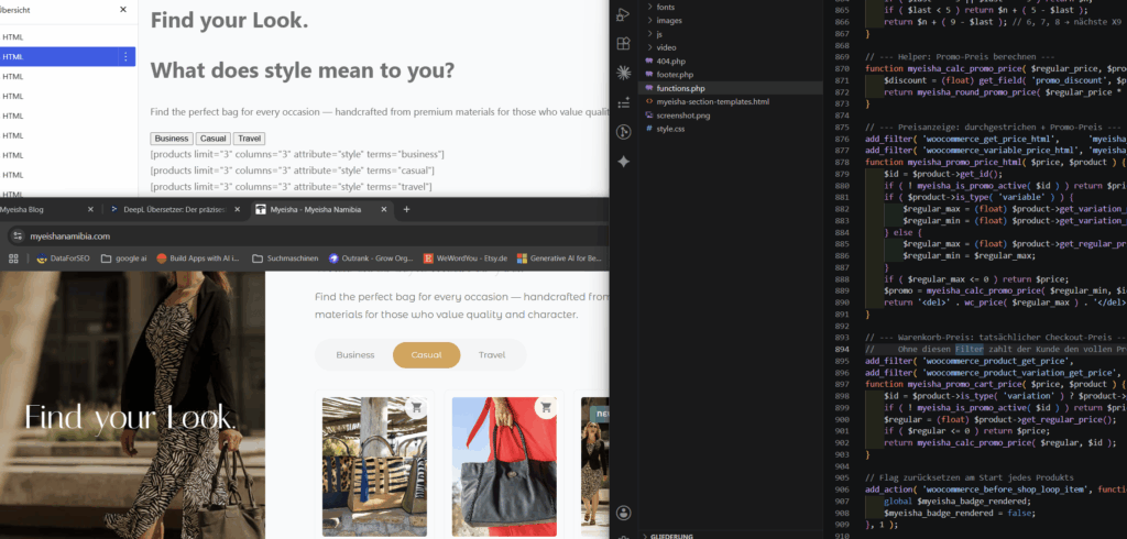
Once the visual direction was locked (or at least agreed upon for the moment — design decisions have a way of reopening themselves), the build began. The stack had to be solid enough to handle growth, flexible enough to keep evolving, and fast enough not to lose customers at page load.
Product structure, variants, shipping logic, payment gateways — each one of those comes with a dozen micro-decisions that nobody outside the process ever sees. How are bag sizes presented? Does the color selector use swatches or a dropdown? Where does the trust signal live — near the price, near the add-to-cart button, or both?
We looked at actual screenshots of competitor shops. We looked at cart abandonment patterns. We argued about button placement.
The Details Nobody Notices (Which Is Exactly the Point)
Good web design is mostly invisible. When the navigation feels natural, when the checkout doesn’t create friction, when the product photography loads crisply without slowing the page down — nobody notices, because it just works. The hours behind that invisibility are considerable.
There were rounds of revision on the product grid layout alone. Spacing between cards. Whether to show prices immediately or draw the customer into the product page first. Mobile behavior at breakpoints that don’t even have a standard name. Every one of those decisions was made consciously, tested, reconsidered, and tested again.
The Part Nobody Talks About: The Stress
Perfectionism has a cost. There were evenings where everything looked almost right and that almost was unbearable. There were moments where a font choice that seemed settled got reopened because something felt slightly off in a particular context. There was the ongoing negotiation between done and perfect — which, in creative work, is never fully resolved.
What kept it grounded was always coming back to the product. The bags are exceptional. They deserve a shop that reflects that. So the standard stayed high, even when it would have been easier to let something slide.
Where It Stands Now
The shop is live. It will keep evolving — it always does. But the foundation is right: the structure, the visual language, the technical implementation. Everything built to represent the brand honestly.
This is the first post in an ongoing behind-the-scenes series. Next time: the photography workflow and how we handled images that needed to work across wildly different screen sizes without losing their soul.